Katie Park
I'm a visual journalist, developer and designer based in Washington, D.C. Currently, I'm a developer at The Marshall Project. I've also worked at NPR and The Washington Post.
Here's some of my work.
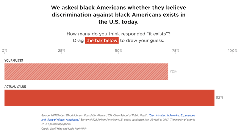
How Black Americans See Discrimination
This was a totally new chart form for us – a draggable bar chart asking users to quantify how prevalent they think discrimination is for black Americans. We wanted to present a simple data point in an engaging way while encouraging users to quantify their own expectation of the data.
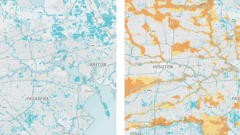
Early Data From Harvey Shows Epic Flooding
I built these maps in QGIS using FEMA flood zone data and an early estimate of flooding after Tropical Storm Harvey. This map involved working with both vector and raster imagery on a one-day turnaround.
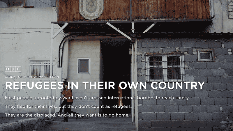
Refugees In Their Own Country
We were lucky for Visuals to be involved early enough in this project that we were able to help shape the format of the narrative. We wanted to provide users with a base level of knowledge about the conflict in Georgia before immersing them in each individual’s experience.
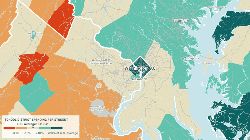
Why America's Schools Have A Money Problem
NPR Viz collaborated with the education desk and EdWeek on an extensive series about school funding. In one of the graphics, we mapped school funding by district using MapboxGL.js and included story text specific to the user’s location.
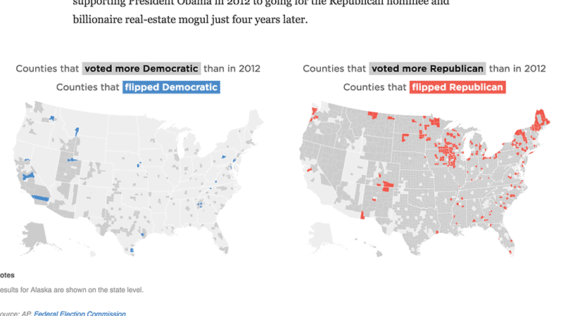
The Counties That Flipped From Obama To Trump, In 3 Charts
Analyzing election results by looking at counties that flipped from one party to another. A developer and a data reporter on the team stitched together current and previous election results along with demographic information, and I worked with the team to sketch out these charts and then design and build them. The maps were originally drawn in D3, but I chose to present them as flat images to keep the page and the flipper animation as lightweight as possible.
Live annotated speech transcripts
I worked on a short turnaround with a small team of developers and designers to create NPR’s live fact-checking rig for annotated event transcripts. Among the challenges was implementing live-updating content within a responsive iframe in order to better integrate the transcript within the CMS.
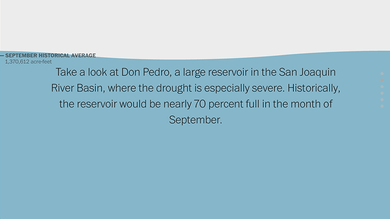
How dry is California?
Exploring the historical context behind one of California’s most severe droughts. The drought lasted from 2011-2017, and this piece was published in 2015.
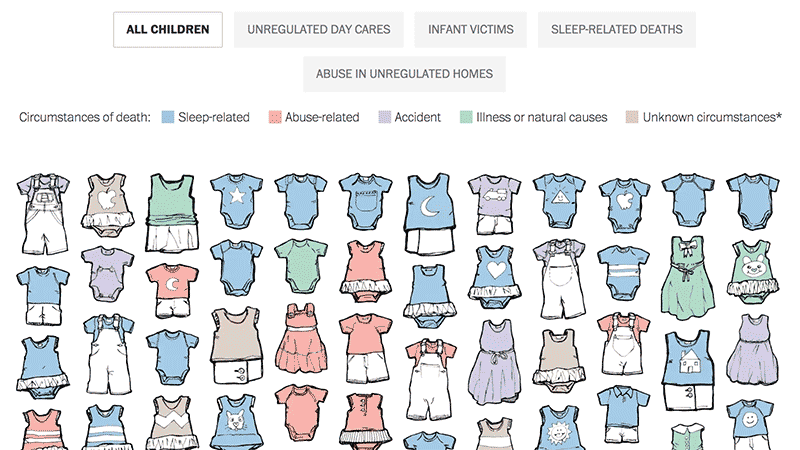
Children at risk: Unregulated day care in Virginia
I worked alongside Lazaro Gamio to conceptualize, design and build this project. With a dataset about children who died in day care, we didn’t want to lose any sense of humanity by creating this visualization.
Where did you work last week? Here are 130,000 answers.
I worked with a reporter and database editor to map responses to the American Community Survey question on how far people commute.
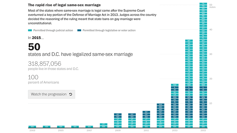
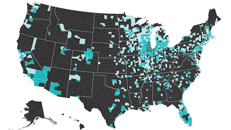
How same-sex marriage became legal
I reported, designed and developed this graphic looking at the speed at which states legalized same-sex marriage.